Overview
Stilesians were asked:
If you lived in the New Haven this Fall: looking back on life in New Haven this Fall (perhaps for the first time!), in which places on and around campus did you end up having meaningful experiences?
If you have been remote in the Fall: Know that you have been missed. Although you have been remote, perhaps some Yale places have been on your mind. Which places on and around campus do you feel most nostalgic for? Have any virtual Yale spaces been meaningful for you?
The resultant data maps the contours of “meaning”—whatever that, incidentally, means—onto our increasingly flexible concept of place. While some of the places that respondents submitted ended up being virtual, many more ended up being physical. The following sections visualize the responses based on these two modes of place.
New Haven Area
For the physical locations, we can imagine a topographic map which reveals the peaks and valleys of our community’s experiences of meaning and nostalgia throughout New Haven. In cartography, contour lines on maps generally indicate the physical elevation of the Earth’s surface. But for our data of meaningful places, contour lines can instead indicate those places that many Stilesians have found meaningful. In other words, the peaks insinuated by the contours below reveal “hot spots” of meaning and nostalgia throughout New Haven.
Feel free to skip past the following code chunk.
## CODE FOR SETUP

# Get Places data, jitter lat/lon for better visibility in plotting points
t <- "20201227_235052"
data.places.physical <- read.csv(paste0("data/places.physical_" , t, ".csv"))
places <- data.places.physical %>%
    mutate(lon.jitter=jitter(lon, factor=2.2)) %>%
    mutate(lat.jitter=jitter(lat, factor=2.2))

# Estimate kernel density and create contour lines
# Heavily adapted from https://gis.stackexchange.com/questions/168886/r-how-to-build-heatmap-with-the-leaflet-package
# Bounding box thanks to bboxfinder.com
kde <- kde2d(places$lon, places$lat, n=c(64, 75),
             lims=c(-72.99461, -72.88622, 41.294898, 41.344599))
CL <- contourLines(kde$x , kde$y , kde$z, nlevels=13)
# Format contour lines as SpatialPolygon for Leaflet
spgons <- SpatialPolygons(
    lapply(1:length(CL), function(i) {
        Polygons(list(Polygon(cbind(CL[[i]]$x, CL[[i]]$y))), ID=i)
    })
)
# Smooth contour lines
spgons <- smooth(spgons, method="chaikin", refinements=5)

# Compute colors for the level curves (https://rstudio.github.io/leaflet/colors.html)
levels <- sapply(CL, `[[`, "level")
colorpal <- colorNumeric(palette="YlOrRd", domain=c(-max(levels)/2, max(levels)))
## CODE FOR ACTUAL MAP

leaflet(spgons) %>%
    addProviderTiles(providers$CartoDB.Positron) %>%
    setView(-72.93, 41.3155, 14) %>%
    addPolylines(color=colorpal(levels), opacity=1, weight=3) %>%
    addCircleMarkers(data=places, lng=~lon.jitter, lat=~lat.jitter, label=~Name,
                     radius=3, fillOpacity=0.8, fillColor="yellow",  # Interior
                     weight=1, opacity=0.8, color="black")  # Exterior
Figure 1: Interact with this map! Hover over points to see their name; pan and zoom around. Darker contour lines represent higher intensity.
Like a topographic map, the map above shows contour lines which guide the eye to points of interest. The more bunched-together the lines, the sharper the incline. The darker the color, the higher the “elevation” in meaning.
Fun notes:
- Extraordinarily large cluster around Ezra Stiles College. (There is also one[1] Morse point.)
- The Stiles Mountain gives way to a high plateau through Sterling Library, Bass, and Cross Campus.
- There is also a noteworthy knob on Old Campus.
- Koffee? and East Rock Park are also so well-loved to merit their own contour lines.
There are also some other clusters which reveal themselves to the eye, even if not the contours:
- Yale Science buildings (buildings on Science Hill)
- Dunham Lab (including the “Math Lounge”) and the CEID dynamic duo
- Off-campus residences scattered around the Yale bubble
- Various green spaces, including East Rock, West Rock, Edgerton Park, and Scantlebury Park
- Various forms of dining
Virtual Realm
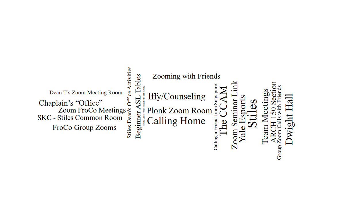
For the virtual places, the venerable word cloud lives to see another day. Unlike with the physical data, no virtual places were repeated among the respondents, so the visualization to follow is arranged randomly.
# Get Places data
data.places.virt <- read.csv(paste0("data/places.virt_" , t, ".csv"))
# Rotate and resize each word randomly
set.seed(2021)
places <- data.places.virt %>%
    mutate(angle=90 * sample(c(0, 1), n(), replace=T, prob=c(60, 40))) %>%
    mutate(size=sample(c(10.4, 10.7, 11, 11.2), n(), replace=T, prob=c(31, 23, 23, 23)))
# Create word cloud
ggplot(places, aes(label=Name, angle=angle, size=size)) +
    geom_text_wordcloud_area(eccentricity=0.4, family="Serif") +
    theme_tufte()
